Helping Arkansas and Nevada residents save for their kid's future
Designed in 2012, public facing websites like Arkansas and Nevada had a lot of usability and performance issues. The site was previously developed with limited feedback from the users and content didn't do a good job of motivating users to browse, learn and enroll in a 529 program. The site also had performance issues and had a high bounce rate of 70%. Our client partners were also unsatisfied with the incremental updates we were making to the old site. They wanted to improve their online presence and drive conversion rates.
Responsible for in-depth research, working closely with client partners to craft the end to end design of the web experience.
Solo Product Designer with guidance from the Design Director, Product Manager, Marketing Manager, & 2+ Engineers. Also partnered with Client partners — Program Director & Marketing Manager from the Arkansas 529 Program.
The site also outperformed. We saw Arkansas site drove enrollments by 10%.
Users subjective satisfaction with the new design was 139% higher.
Year end survey revealed that our client partners gave us a NPS score of 9.2.
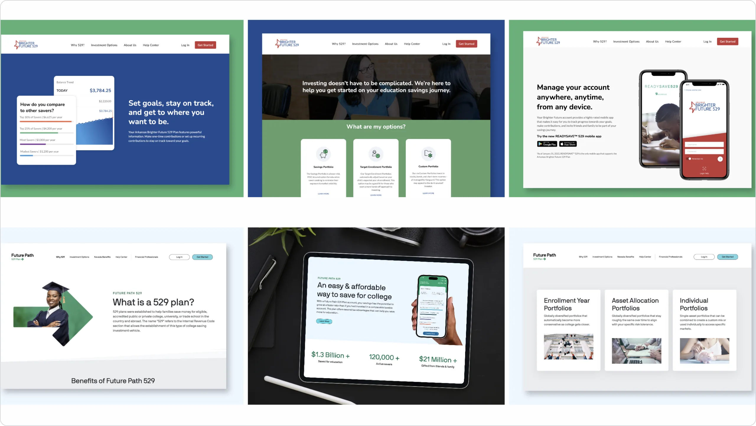
The next step was to analyze our competition. We wanted to benchmark our own UX design against industry standards and best practices. By understanding what our competition is doing well or poorly we hoped to find areas of improvement and opportunities to differentiate ourselves in the market.

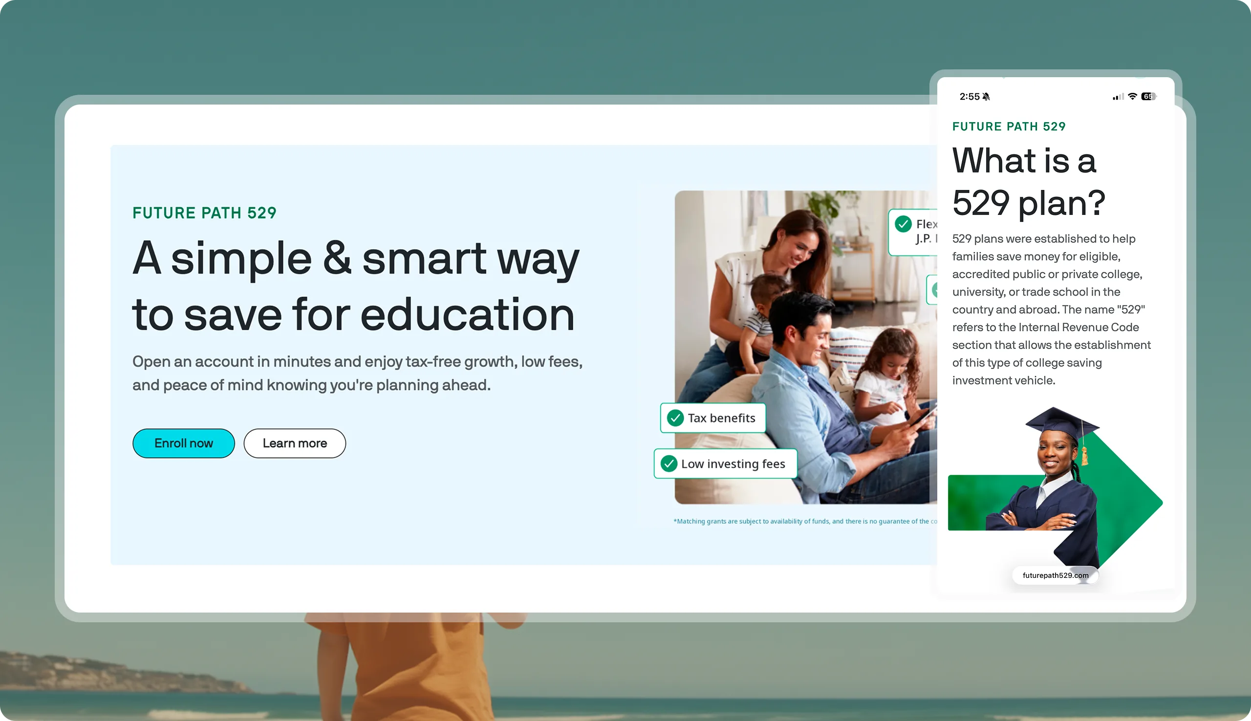
Clear & Compelling Value Proposition and smooth path to becoming a saver
Refute misconceptions & reflect customer budget behavior
Make the browsing experience less of a challenge by providing modern UI
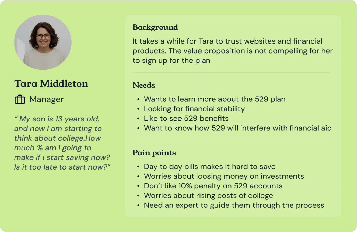
The first thing we did was to send out a survey to gather as much data as possible about our users demographics, budget behaviors, saving patterns, general familiarity with a 529 plan and their approach for saving for college. We learned that our prospective users needs and goals mostly changed based on two things — their household income and the age of the beneficiary. Based on the data we collected, we grouped our personas into categories.
After reviewing the survey data, it was clear to use that our target users were Arkansas and Nevada residents with beneficiaries ranging from new-born to 13 years old. In order to get a better understanding of the user we spoke to our users by conducting moderated user interviews and usability tests. By doing this, we were able to capture how they were using our old website and what value they took from it.
Clearly communicate the value proposition in an easy to digest way
Guide users through investments and make it easy for them to take action
Showcase user success stories as a proof of activity and impact
Show faces behind the plan to build trust and confidence in the user
Highlight specific features of the plan and allow users to take action
Show the impact the plan has had on community members for social proof
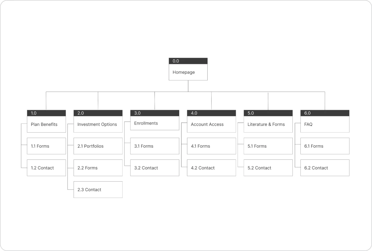
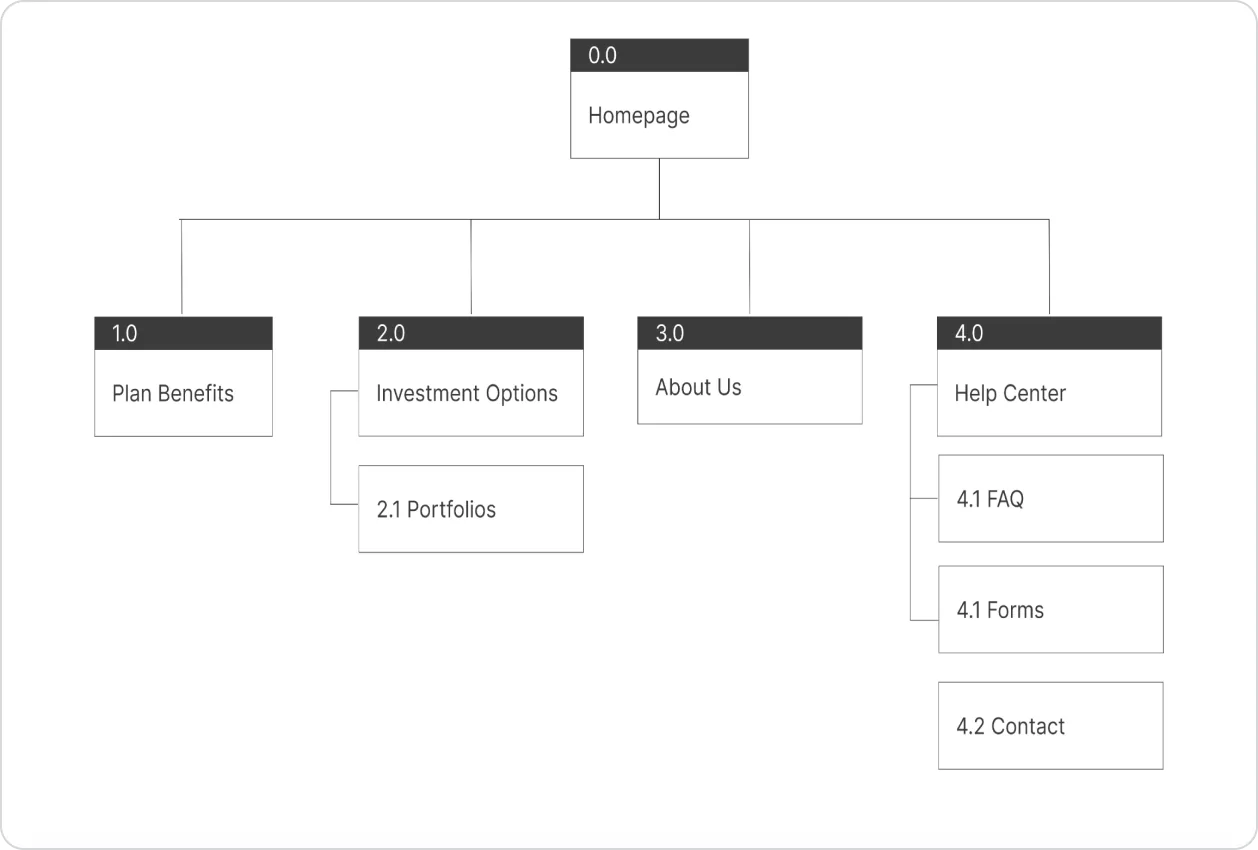
The old sitemap was nested in deep hierarchies and that made it incredibly hard for the user to find information they were looking for. Once I had gathered all the data from the card sorting exercise, I created a few variations of the sitemap to visualize the overall information architecture of the website. Our goal was to simplify the navigation as much as possible and not overburden the user with too many links or pages.
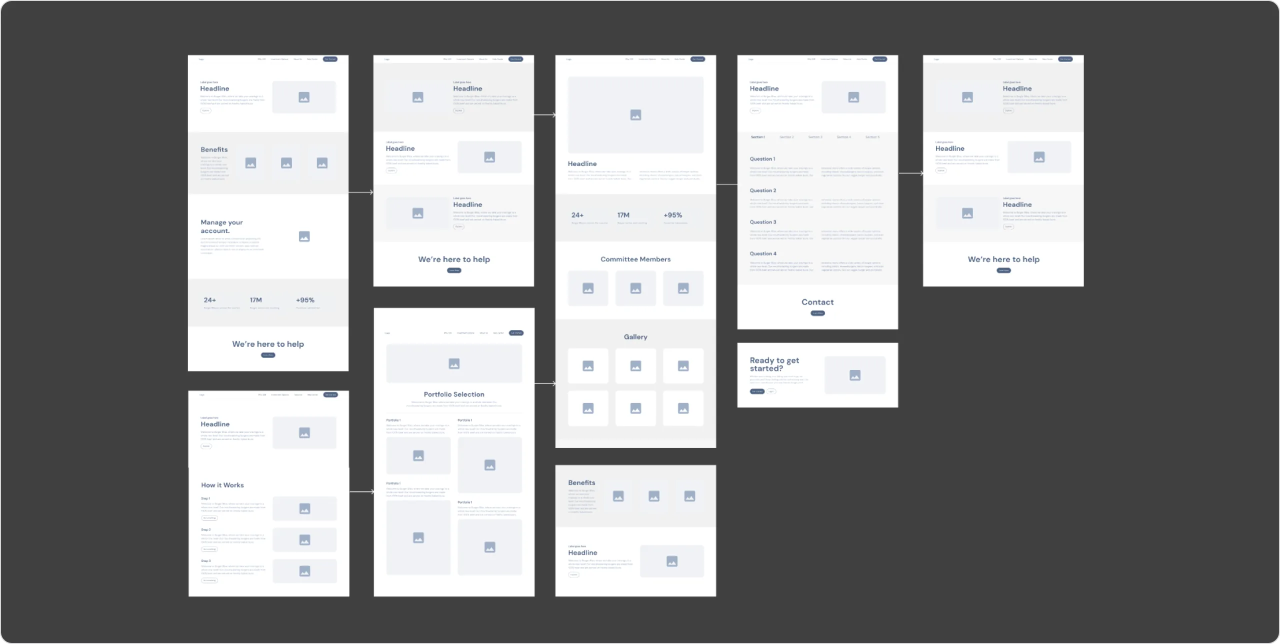
Once I had a better sense of the overall architecture, we narrowed down multiple user flow options and created mid fidelity wireframes and prototypes. This served as a foundational step as they allowed us to visualize the structure and layout, facilitate communication, prioritize functionality, support iteration, identify usability issues, enable collaboration, and offer cost-effective design exploration.
We recruited a total of 6 Arkansas residents that matched our target user through a recruiting agency. Our goals for the testing were to: Test discoverability and usability of new interaction flow, Validate the new information architecture, Learn about user behavior, especially around their familiarity and motivations towards saving for college.
Simple navigation makes it easy for the users to discover pages and easily learn about 529 plans. Users found it harder to access and find relevant information on the older site due to its complex navigation. This made us pair down the nav.
Users don't have time to go through the entire site, they need easy and quick access to information. We solved this problem by breaking information into digestible chunks and making it easily readable so users don't have to dig deep to find this information.
Once the feedback was gathered from our users, it was time to integrate it into our designs and put it all together. I created the High Fidelity mock ups and put together a documentation system with detailed specs for all the elements and components on the site. This detailed design system was used to communicate requirements to engineering teams, quality assurance teams and ADA compliance teams to test different use cases.