
Helping people consume
knowledge mindfully
RESPONSIVE DESIGN . PRODUCT DESIGN . RESEARCH
RESPONSIVE DESIGN . PRODUCT DESIGN . RESEARCH
OVERVIEW
Our initial idea for the project came from really smart and successful people at Google. We knew that successful people read a lot, so naturally our objective when we started this project was 'how do we get people to read more?' Or 'How do we help people consume things in a better way?' Our goal was to develop a responsive web app and an extension to help users save or bookmark articles, video and audio content in an engaging and effective way.
MY TEAM
Solo Product Designer with guidance from the Design Director, Product Manager, 3+ Engineers
MY ROLE
Responsible for in-depth research, working closely with internal teams and consumers to craft the end to end design of the mobile experience.
TIMELINE
March 2021 -April 2021
The Approach
Focusing on user insights
To help understand the target market, their goals and motivations better, we sent out surveys and conducted in person interviews with a bunch of people. Some of the important takeaways from our research was that people who used 'save it later' apps like Instapaper and Pocket often had difficulty coming back to saved/bookmarked items. They are usually overwhelmed by the sheer amount of bookmarked links they had collected over the course of weeks, months or years. We realized from early on that this was a hard problem to solve.
The Challenge
How do we improve engagement and retention on a platform such as this?
Why would somebody come back to a read it later app? We knew from the interviews that users might save a lot of things but they would never end up going back to it. We had to ask ourselves the following questions to help bring clarity into this project.
1. What is our value prop going to be? How can we make it compelling?
2. What would make users want to come back to these apps?
3. Engagement and retention is going to be a big problem. How do we improve this experience?
Discovery
Persona Development
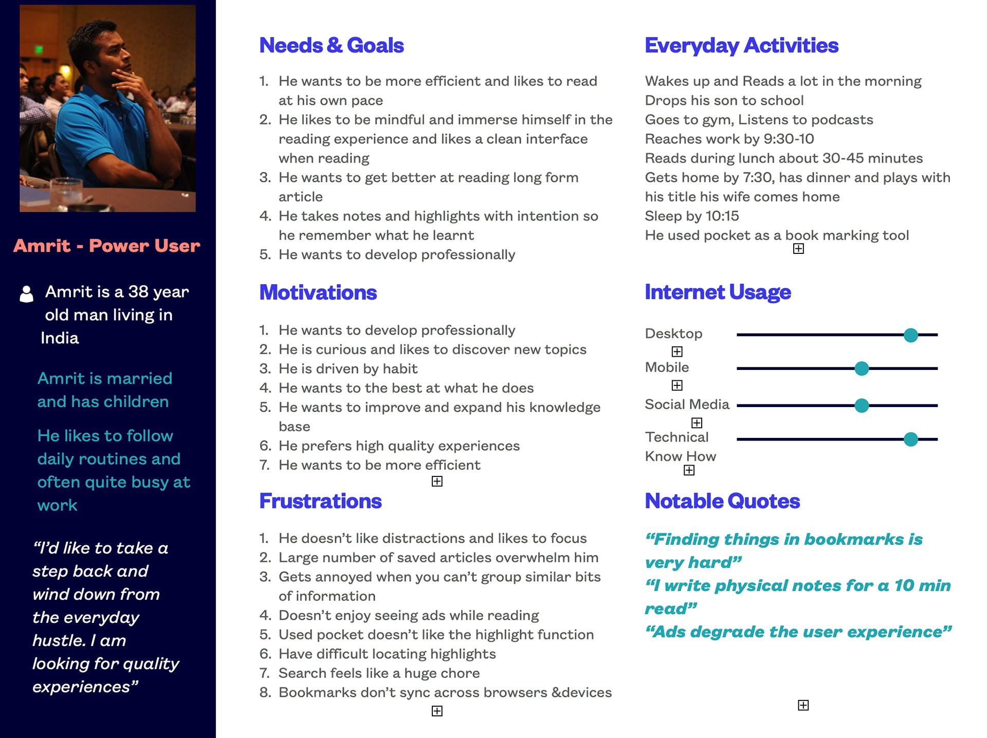
User discovery phase allowed me to gather qualitative and quantitative insights about the user. Getting into the mindset of the user helped better understand their goals and motivations better. Affinity mapping exercises and empathy mapping led me to group personas with similar motivations together. Bookmarking and read it later apps meant different things to different users. Some of the user insights gathered during this phase ultimately set the design direction of the product. Below image showcases the core user personas of our key target users - Power User & the Casual Reader.

Customer Journey
By visualizing the end to end experience and focusing on users goals, and frustrations, I was able to uncover different challenges and opportunities at every step of the user journey.This ultimately led me create user journeys with an aspirational emotional state in mind. The next step of the process was more research and problem solving. I created a report for all the identified designs challenges and the approach we would take to solve them.


Exploring challenges and opportunities this way, we were able to focus on all the problem areas at each step of the way. Some of the questions we asked ourselves were,
1. How do we get users to organize bookmarks at the creation time?
2. How do help users make sense of this data?
3. What are some of the design areas we can improve to elevate the bookmarking experience for our users.
At about the same time we came across a study about how people consume and organize their personal webspace. Some of the insights that we discovered from this study were:
📖 Users with bookmarks over 100-300 generally organized bookmarks
🙅🏻♂️About 37% of the users did not organize bookmarks at all
🕵🏽♀️Most users who organized their bookmarks did it to help retrieve useful content at a later time
Some of the challenges users faced during this study was :
👩🏽💻Users often ended up forgetting where they stored their bookmarks
🕵🏽 It was incredibly to hard to retrieve something from a deeply nested hierarchy of folders
📜 Titles of bookmarks are not descriptive enough to remember
Considering these results, we were able to pin point design recommendations in 3 main areas
Users should be able to sort and organize content at creation time
Visualization directly effected the sorting capabilities
Bookmarks were not descriptive enough. They need to be descriptive titles at High Level
Competetive Analysis
We had explored the marketplace and analyzed various apps like Raindrop IO, Instapaper, Wakelet, Diigo, Google Keep, Pocket, Pinterest and Digg. Some of the insights from this study were that: 1. Some Read it later apps were used as bookmarking tools and users often had a hard time differentiating the two 2. Most of the bookmarking tools worked in conjunction with note taking tools. Most people often ended up using 2-5 different apps in conjunction with note taking apps to accomplish a specific goal. There was no one tool that allowed users to manage their personal knowledge.There was an unmet need for a knowledge management tool. We identified a huge market opportunity for our product here.


Re-evaluating our vision
Should we build a knowledge management platform instead?
We started to realize that users found note taking to be an important part of their reading journey. We decided to re-prioritize our goals and vision to build a knowledge management system instead. We wanted to help users not only sort, organize and read but also help them absorb knowledge while consuming content.We realized that if we incorporate note taking capabilities to the platform users will be able to better utilize the platform and they would focus on building knowledge instead.We referred to the Zettelkasten method of note taking and reframed our problem statement from:
How can we help someone read something?
➡ How can we help them absorb knowledge? How can we build a knowledge management system?
Solution
We wanted to create anew way to manage knowledge. To put it simply, we get our information from various sources. We read articles, watch videos and listen to podcasts. But it is becoming increasingly difficult to remember everything we have consumed. How do we make sense of all this? How do we connect an idea that came from a book to an insight we got from a watching a documentary. This is where SAVD comes into play. By incorporating note taking and Zettelkasten method, SAVD can help users link different ideas together and remember them in the long term.So essentially this platform would help users collect and save information. This way they will be able to construct and organize their personal webspace while getting better at learning what they have read.
Task Analysis & User Flows
Once I had a clearer picture of what our product was going to be. I started envisioning how users would interact with the product. This lead meextract job stories and corresponding users tasks. Wedecided to focus on one feature of the product at a time and started with bookmarking journey and created user flows to better understand how user would use the product when using the feature.


Low Fidelity Wireframes
I started sketching out lo-fi wireframes for the bookmarking feature of the app. By utilizing user scenarios and job stories I was able to come up with a variety of use cases. I referenced universal UI design patterns and UX best practices for every state and instance. This way I was able to generate multitudes of screens.

Hi Fidelity Wireframes
Once the lo-fi wireframes were approved, I started to work on hi-fi mock ups and prototypes. Figma was the tool of choice and the prototypes were created to understand the overall flow and movement.
